Elsa dead at 83

Self-Portrait, Sept 15, 1986
 © Museum of Fine Arts, Boston

Toronto. Elsa Dorfman of Cambridge, MA was best known for her huge (20x 24 inch) polaroid portraits, In an article by Deborah Becker on May 30th this year, Station WBUR announced her death (1937 – 2020). Her husband, Harvey Silverglate, attributed her death to complications from kidney failure.

Have a look at both the above links to see the effect Elsa had on  photography. Her death was mentioned at a recent executive meeting. Bob Lansdale followed up with a note on June 6th, attaching a screen grab from the  PHSNE newsletter on Ms Dorfman.

She had a wonderful rapport with the subjects of her portraits as can be seen in the photo at left (click to enlarge, or visit the WBUR link).

Posted in people | Tagged , , , , , | Comments Off on Elsa dead at 83

I, said the page …

1870 image from TPL archive titled “Robert Cunningham, reporter for Toronto Daily Telegraph, and Indians, beside canoe”

Toronto. … beginning to fade. A line in the song dedicated to the late Marilyn Monroe called, “Who Killed Norma Jean” sung by Pete Seeger, in answer to the question, “who will soon forget?”.  In this age of digital photography, we forget just how easily the old photographs faded, especially when poorly washed after the processing.

In the mid to late 1800s, charlatans abounded in the industry and fading was a common lament by folks who had paid for a “likeness” taken by such an unskilled person.

This original is held in the Toronto Public Library digital archive. Clicking on the icon at left you can see the transformation by George Dunbar using modern day computer technology to increase contrast giving the century plus photo a much punchier contrast.

Mind you some proprietary  processes like the chromotype photographs (collected by our journal editor – see Photographic Canadiana vols 31-1, 31-2) do not fade and are as sharp and as full of highlights and deep tones as when first made. Such photos are uncommon and can be easily spotted by the practiced eye.

Posted in history | Tagged , , , , , , , | Comments Off on I, said the page …

so’s yer mudder

a camera only a mother could love …

Toronto. When I was a kid, one of the insults we hurled at each other was “your mudder’s so ugly she wears army boots”. And the rebuttal was, “so’s yer old mudder”. Well in my opinion, the 1965 Kodak Instamatic 800 is down right ugly. Then again we came through a time when North American cars looked like jet aircraft.

The marketeers touched all bases to make this camera   series idiot proof.  Unfortunately in doing so it was all awkward corners and bits that jutted out. Not a pretty design even for the mid 1960s. Remember Leitz sold the beautiful, ergonomic M series at the time. This ad from page 19 of the April 2, 1965 LIFE magazine shows what Kodak considered an elegant design. The film used was another Kodak design, a drop-in film cartridge that even a klutz could change and not mess things up.

My thanks again to my friend George Dunbar for suggesting this bit of history when Kodak was the huge factor in North American photography.

Posted in history | Tagged , , , | Comments Off on so’s yer mudder

make everybody welcome

William Bell and Grandma, from the Bell-Sloman Collection of the James Gibson Library, Brock University

Toronto. I have been a member since the first year of the PHSC and in that time we have had speakers and members regardless of race, religion, or gender (the full gamut). In that time I have seen only one black photographer and a few women as members. In later years, we saw more female photographers, female speakers, and speakers of colour.

The photo at left is from the Bell-Sloman Collection  in St Catharines, Ontario. It was sourced from the talk given by Dr Julie Crooks of the AGO in February 2018.

As a society (especially in Canada), we can all be more open and embracing. On behalf of the PHSC, our VP, Ms Ashley Cook, wrote the following heart-felt message in reaction to the sad death of George Floyd south of the border and the ensuing days of discontent world wide:

“We don’t know what to say, and words may not be enough right now, but we will not stay silent.

“We acknowledge that we need to show more diversity within the photographic history of this country. This is the time to learn, build empathy, and understanding.

“BLACK LIVES MATTER”.


Posted in history | Tagged , , , | Comments Off on make everybody welcome

dyna-what?

Dynachrome 35mm slide film ad in LIFE

Toronto. In the March 27th, 1964 issue of LIFE magazine (p42), the 3M company ran this unusual ad for a colour transparency film called Dynachrome. Did you ever use it?

In 1954, the American government was hell-bent to separate any perceived trusts by large companies . In that year, Kodak was forced to separate Kodachrome manufacture and processing.

When Kodachrome patents expired, some organizations made a Kodachrome clone with built-in processing, selling for the price of Kodak’s film alone (companies too small for the trust busters). Around 1959 a clone was made by Dynacolor and called Dynachrome. Around 1963, the company was sold to 3M and the above advertisement showed up and ran for a few months in LIFE magazine. 3M used price to whittle off a bit of the burgeoning amateur photography market for itself.

You can read more detail about the history of the film and the suspected production and processing variations underneath the marketing names on the Photography Forums web site.

A big thank you to fellow PHSC member George Dunbar for spotting this bit of film history and passing it along.

Posted in history | Tagged , , , , , | Comments Off on dyna-what?

trifecta

Toronto. Our third executive meeting was held last evening (Wednesday) via ZOOM and co-ordinated by Celio (great work!). The PHSC will continue using ZOOM at least until the pandemic restrictions are lifted. The telephone symbols show two members of the executive connected via telephone only.

ZOOM screen grab when meeting was in progress

Posted in history | Tagged , , , | Comments Off on trifecta

who the heck is Hurter?

Hurter by Driffield

Toronto. Ferd Hurter and Chuck Driffield worked together in England. They were known in glass plate and film days for the H&D Curve. In 1890, the two spent their spare time as amateur photographers. They gained recognition after publishing  a way to accurately determine glass plate (film) speed and contrast based on their experiments.

Their H&D curve correlated negative exposure with glass/film density after development. Before this dynamic duo worked their magic, the speed of any photographic dry plate measurement was empirical only (a “by guess and by god” approach). They devoted their personal time to accurate sensitometry, gamma (contrast), latent image theory, etc.

Theirs was an age of photographic research, study and standardization necessary to make exposure of dry plates and film reproducible in the days when creation of sensitive materials, exposure, and development were no longer necessarily done by one experienced person in a very brief period of time during an afternoon.

Posted in history | Tagged , , , , , , | Comments Off on who the heck is Hurter?

making the grade

curve mapping exposure to various grades of paper. from Basic Photography by M J Langford 1965

Toronto. This post refers to film (black and white)  printing. Once you choose the huge number of variables for a photographic paper choice, you are left with one last factor – paper grade.

Ideally, the chart shown at left (3 grades, but some papers go to 5 or even 6 grades) shows how the negative printing exposure (exp.) maps to the paper using different grades. If it was only that simple a choice! Paper surface type, illumination type, grade, etc. all affect the final contrast on the paper. Ilford and other big manufacturers came up with double coated papers. One coating was very low contrast, the other very high contrast. Filters gave an exposure in various ratios of the two emulsions allowing one package of paper to cover a full range of paper grades from soft to hard.

The dynamic range from dark (shadow) to light (highlight) in the eye is very great. This range must be compressed in the film and crunched even further in the print. Film sensitivity and developing process affect the scene contrast. Basically the slower the film, the greater the contrast (and finer the grain). If a film is under-exposed or developed, the result is a very thin scene (flat). A contrasty paper grade may help a bit but shadow detail must exist for the print to show it. Alternatively, an over-exposed or developed film (negative) makes for a very dense scene. A softer paper grade (lower number) may help but once again detail must be in the negative or the highlights just block up on the print and show a flat tone.

Lots of books were available in the latter half of the last century to show how to properly expose and develop a film and the properly print each scene so there is some detail in both shadows and highlights and the over all contrast is from very light detail to very black (dark) detail. Not an easy task. It takes hours of study and experiment to get it right technically. Then you are stuck with the real artistic effort entailed – lighting, scene, framing, mood, etc., etc.

Posted in film | Tagged , , , , | Comments Off on making the grade

paper doll

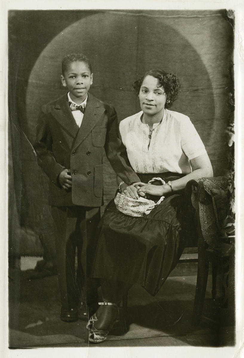
Portrait by David Hamilton on Ilford Ilfomar A117 paper c1970

Toronto. To convert a film negative into a positive image, a second piece of the sensitive medium was usually used. Most commonly this was a photographic (light sensitive) paper. And there stood the dilemma for the average beginning photographer.

There was a mind blowing number of factors to consider: manufacturer (Kodak, Ansco, Ilford, Agfa, etc.), sensitivity (fast for enlarging, slow for contact printing, P.O.P. for temporary samples), weight (DW or double weight was thicker and easier to handle, SW or single weight was cheaper), size (8×10 inches, 11×14, 16×20, 4×5, etc. – bigger was cheaper and could be cut to smaller sizes), tone ( a toner bath could vary the print colour a bit).

And texture! Whole booklets were devoted to the wide variety of textures offered for monochrome printing. With colour, the choice was far less. At one time a geometric texture was used on commercial colour paper to mask the poor resolution inherent in 1950s colour media.

With colour, you were usually limited to one grade – your exposure and development were  spot on, or not. For monochrome, a series of grades were offered to determine the contrast of the print (or make it a high key print). Dodging and burning could adjust contrast for some parts of the print such as adding shadow or highlight detail (if this existed in the negative, of course).

The title of this post is an homage to a 1915 song, of the same name made popular during the second war by the Mills Brothers.

Posted in film | Tagged , , | Comments Off on paper doll

use da fixer

Sir John Herschel by J M Cameron. Restored by MM of A in NYC

Toronto. The first successful photographic processes used a weak salt solution as a fixer. Earlier experiments showed silver nitrate solutions reacted to light and could record scenes, BUT the silver nitrates quietly turned the whole medium dark. There was no way to turn off the silver salt (transparent) to metallic silver (opaque) process!

Shortly after the 1839 photographic processes were announced, Sir John Herschel suggested using Hyposulphite of Soda (Hypo) as a fixer.  Sir John had discovered its property two decades earlier! The actual chemical turned out to be sodium thiosulphate, but the name HYPO stuck for many, many decades. When I turned to photography in the 1950s, the terms hypo and fixer were interchangeable and in common use.

Hypo or fixer had one simple job to do: wash out the remaining silver halides in the medium so they could not slowly convert to metallic silver and destroy the image. A lengthy water wash in turn removed the fixer.

Posted in history | Tagged , , , , | Comments Off on use da fixer