The Photographic Historical Society of Canada
Fine Digital PrintingAndrew Patrick
Program date: March 18, 2009
Andrew Patrick
Film vs Digital

Dynamic range

sRGB gamut

Channels
Saturation

Monochrome

Colour management

Huey by Pantone
Andrew Rodney

Doug Dubler for Epson

Midtone Contrast

Setting B&W points
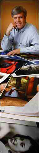
Andrew Patrick (portrait at left by Bob Lansdale) has many years of experience in photographic sales, currently with Epson Canada. His talk introduced many of us to the current state of digital printing and how it compares to early digital printing and the traditional silver-halide processes. Only a few of the audience are using digital equipment (those with no digital experience must have felt like a daguerreian photographer attending a lecture on the nuances of wet-plate technology…).
Andrew began with a brief primer on digital imaging. His first eye-opener for me was that the modern inkjet printer can make prints with a colour gamut 42% larger than possible with silver-halide processes - which means more colours for subtle shades in the print. Add to this the fact that digital prints now have an estimated fade resistant life five times greater than silver prints and we see that the days of traditional photographic prints are rapidly ending. He noted that anyone re-printing old digital files on a new printer will see colour and detail superior to that of prints made just a few years ago.
In the early years of digital, emphasis was on print file size (80 meg for example). This was due to the traditional view of the resolution needed for the printed image. Film cameras with good lenses created fine detail in the negative. But the next step could compromise that detail. Enlarger lenses often had a lower resolution, softening the final print detail. A negative's enlargement potential depended on its visible grain. Today’s digital cameras register 10, 12, 20 or more megapixels of detail and eliminate the enlarger step. Early digital cameras had a bit depth of eight limiting the results to 256 shades of gray which often resulted in banding or posterization in large colour areas like a sky or a wall. Cameras today are often ten or twelve bit giving over 4,000 shades of gray in each colour channel. The trend is to an even greater bit depth of 14 or 16 for medium format digital backs, offering over 65,000 shades. Shooting in raw format means even with 16 bits the files are not much bigger than 12 bit files.
To illustrate the comparison of traditional and digital, Andrew used an image he took with a c2000 Canon D30 - the first Canon with a non-Kodak imager. The camera records 3 megapixels creating a 10 megabyte, 10 bit (1,000+ shades of gray) raw file. The comparison image was shot on 35mm colour film and scanned, creating a 27 megabyte file. At 20x magnification, the film scan is very grainy and muddy while the Canon image shows cleaner colour and no grain. Note: Andrew's slides were projected with an uncalibrated 800 x 600 digital projector. I captured the projected image with my Sony camera and cleaned them up a bit in Lightroom and Photoshop. As a result, the difference between the D30 image and the film scan is not as obvious.
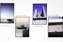
In another example, Andrew held up a large 60 x 40 inch print made from a file created by a 10 mpx Nikon D200 camera. The night scene shows the odd bit of digital artifacts on very close scrutiny -- totally invisible at normal viewing distances. A picture of a boat sitting in snow was snapped with a pre-release Nikon D1 (a grab shot in program mode). The resulting print shows good highlight and shadow detail. A film shot would have had either blocked shadows or blown highlights. The digital image benefitted from the wide seven to eight stop dynamic range of the D1. As noted in the above paragraph, the process of projecting and capturing the image makes it hard to see the importance of the D1's wide dynamic range.
After this background to digital photography, Andrew moved on to printer basics. Digital printers operate internally as RGB devices even though the inks are CMYK. This is a result of an early industry decision to standardize on an RGB colour gamut for all digital devices. This colour space is called sRGB (standardized RGB) and represents the largest colour space covered by all the digital devices, forcing it to match the weakest link in the equipment of the day - the eight bit colour monitor (no colour printers existed then). In one of the images at left I have a colour gamut with the much reduced sRGB gamut inside the grey area representing our visual colour gamut.
To print a B&W image, today’s inkjet printers use an algorithm to convert the print file to RGB data (in spite of using CMYK inks, the injet printers are RGB devices). The result is always a colour cast (look closely at a B&W print from an inkjet printer, and you can see the tiny specs of colour that create a gray shade). Using software like Photoshop, there are a number of ways to create a B&W (monochrome) image. Some methods have the flexibility reminiscent of using colour filters on a film cameras.
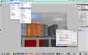
The simplest (and poorest) way is to delete any two of the colour channels in the file, throwing away ⅔ of the image data. This data can be preserved by desaturating the file instead, but this gives you no control over the conversion of colour to grayscale. Photoshop provides a channel mixer to give the user some control while keeping the RGB data colour neutral. Clicking the "monochrome" box in the palette gives a grey scale where the conversion of each colour can be adjusted separately. Photoshop plug-in filters such as those by NIK give better control but result in permanent changes once the file is saved. The newer releases of Photoshop offer a non destructive way to adjust the B&W image via an adjustment layer which is saved with the file and can be reset at a later time. Note: I replaced Andrew's slides showing Photoshop palettes with my own screen grabs to get a better image for the web.
Colour management is an important part of good colour printing. The colours seen onscreen must be accurately duplicated in the printed image. Today, colour goes well beyond the old sRGB gamut still used in jpeg files created by digital cameras (raw files do not have this gamut restriction). Even the slightly larger Adobe RGB gamut has given way to the ProPhoto RGB gamut. Using ProPhoto RGB colour space, inkjet printers can generate subtleties of colour beyond what can be seen on your monitor.
Photoshop preceded digital photography as a tool to adjust images intended for magazine printing with its small colour gamut. Colour outside the printing press gamut were simply cropped or abruptly compressed to fit. Out of the box Photoshop, Lightroom and Aperture still default to the old magazine standards. For photographic use the Color Settings in each program must be changed to preserve colour data in the image files.
In Photoshop preferences, Andrew recommends you set your “Working Spaces - RGB” to “ProPhoto RGB” - the largest gamut available today. By setting the “Color Management Policies - RGB” to “Preserve Embedded Profiles”, a file’s imbedded colour gamut will be honoured within the working space. “Conversion Option Intent” is very important as this setting determines how the program handles colours that fall outside the colour gamut. Perceptual is the desired setting for photographic use. This setting proportionally adjusts all colours to fit in the gamut such that the desired colour perception of the image is maintained. The other two “Intent” settings are only of historical interest today since inkjet printers far exceed the narrow gamut of the old printing press. Note: If you are saving an image for the web make sure you check the sRGB box on the "Save for Web & Devices" palette. Clicking the "Preview" button on that palette will show the image in your default browser.
The above steps preserve the image colour data in modified files, but do not ensure that the print colours will match those shown on the monitor. You must know your monitor is showing colours correctly. This is done using a device that measures the screen colours and creates a profile of any variations. This profile is then used to adjust the LUT (look up table) in the computer's video card to correct the monitor colours such that an image file you adjust will display correctly on any other properly calibrated monitor. Even new monitors need to be profiled and re-profiled every month. Programs like Photoshop use the profiles to adjust the data sent to the printer. Andrew recommends visitingyour printer manufacturer’s website to download the most recent printer drivers and printer profiles. For example, the Epson drivers were revised to match the 16 bit capability of the Macintosh OS X 10.5 (Leopard) operating system released last summer. A number of calibration devices are on the market ranging from the inexpensive “Huey” to the high end Gretag Macbeth.
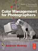
For more information on colour management, pick up a book such as Andrew Rodney’s “Color Management for Photographers” or sign up for a one day “Epson Print Academy” seminar when it’s back in town.
The sample prints Andrew displayed were a convincing testimony to the quality of modern inkjet colour images. Shown in the left sidebar is a fashion shot taken Douglas Dubler for Epson. The screen image just doesn't convey the colour quality of the epson print - outstanding!
After his talk, Andrew added a wealth of other useful information during the Q&A session, some of which is listed here:
The Photoshop Midtone Contrast slider does a good job matching print contrast to the monitor.
(click the "Show More Options" box in the Shadows/Highlights palette to see this slider).
Set the black and white points to use all the image data on the paper - don’t leave any “on the table”.
16 bit images let you set black and white points without “combing” the histogram.
Use Photoshop for colour management NOT the printer driver - it has too few choices.
Never leave colour management switched on in both Photoshop and the printer driver!
Aperture and Lightroom programs allow you to name and save printer settings for future use.
All modern inks and papers give superior colour and life compared to silver halide processes.
All modern printers can give results as good or better than drug store photo quality (4x6 print).
Newest Epson printers are 10 ink HDR printers in 24 and 44 inch paper widths.
In future, expect bigger gamuts, more ink colours, more highlight and shadow detail, and better screening.
Printer technology includes the ink and paper. You lose easily 50% of that value with 3rd party inks.
The correct glossy paper for your printer gives deep blacks and long life.
Epson uses Micro piezo print head technology vs the thermal process used by others.
With Epson, the print head is built into the printer, not the cartridge and self caps when the printer is off.
Epson uses resin encapsulated pigment inks - the micro drops land better - more accurate, better adhesion.
Thermal heads will melt resin encapsulated inks, so most third party inks use the less stable dyes.
About half the value of the printer is in the ink cartridges.
Printers using larger (eg 80ml) cartridges give lower operating cost.
For example, the cheaper 2880 printer has small ink cartridges while the more expensive 3880 has much bigger cartridges. Comparing the usage cost, the two printers have about the same operating cost since the large 80ml ink cartridges are cheaper than buying a number of smaller cartridges to match the ink volume.
Pigment inks stick. Modern printers have self-capping pigment cartridges, so shut off the printer when not in use.
Dyes don’t stick.
Thermal printers have extra print head nozzles and automatically switch nozzles as they plug-up until all are clogged, then the head must changed.
The following links provide access to additional information:
Why don't my prints match my screen (one of many great articles by Northlight Images)
Colour Management Tools (A list of the informative reviews by Northlight Images)
Vistek has a wide choice of calibrations tools
(I bought a
Datacolor Spyder 3 Pro)
This page was designed in Dreamweaver CS4 on an iMac running OS X 10.5 (Leopard). Unless otherwise noted, images on this page were taken with a Sony F828 digital still camera and subsequently adjusted in Adobe Photoshop Lightroom V2.2 and Photoshop CS4. Presentation images are ©2009 by Andrew Patrick and Epson Canada and may not be used without their permission. Contents and all other images are ©2009 by the Photographic Historical Society of Canada and may be used freely provided the source is clearly indicated. Copies of photographs displayed during this presentation may not be used without the copyright holder's permission. Contact PHSC at info@phsc.ca if you would like more information on the items discussed on this page.
Bob Carter